Increase the readability of your text!

Keep your audience awake through interaction!
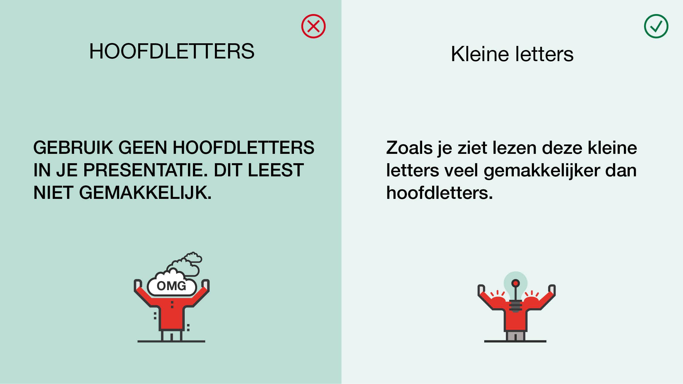
Research indicates that reading speed decreases by 20% when using capital letters. We primarily recognize words by their shape. The issue with capital letters is that they tend to look too similar to one another and are all more or less rectangular.
That explains why the text on the right side of the screen is much easier to read than the text on the left side.
Furthermore, the use of capital letters is often associated with shouting or inappropriate comments, especially in online environments such as social media or comments in newspapers. By avoiding capital letters, you can prevent potential misunderstandings and maintain a professional and respectful tone in your presentations. Using a consistent and legible font style will help your audience follow the content more easily and better understand what you're saying.
Exceptionally, you can use capital letters in sentences with 1 or 2 words when giving commands. For example: "DO IT," "NO!" or "STOP!"
In conclusion, for effective presentations, it is advisable to avoid everywherecapital letters. By using a clear and legible font style, you enhance readability, prevent confusion, and ensure that your message comes across clearly to your audience.